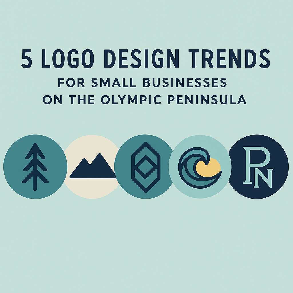
When it comes to building a successful local business, your logo is more than just a graphic—it’s your first impression. On the Olympic Peninsula, where community values and individuality go hand-in-hand, your logo plays a critical role in defining your local business identity . As a designer who lives and works right here in the community, I stay on top of modern branding strategies while making sure every design reflects the unique spirit of the Peninsula. If you're thinking about creating a logo—or refreshing the one you have—here are five logo design trends that are making waves in 2025: 1. Nature-Inspired Elements Small businesses on the Olympic Peninsula are increasingly embracing designs that reflect our surroundings—mountains, forests, coastlines, and native plants. Whether it's a minimal line drawing of the Olympics or a stylized lavender sprig, logos grounded in natural elements help build a sense of place and authenticity. Why it works: It tells customers, “We’re rooted here.” And for locals and tourists alike, that message builds trust and connection. 2. Simplified, Versatile Icons Gone are the days of overly complex logos. The trend now leans toward clean, versatile designs that work across digital and print—whether it’s a business card, a shop window, or a social media avatar. Think: bold shapes, flat colors, and strong typography. Why it works: A simplified logo is easier to recognize, easier to scale, and leaves a stronger visual impression—especially important for businesses trying to grow or reach new markets. 3. Hand-Drawn & Human Touches In contrast to big-box polish, local businesses are embracing logos with character —hand-lettered fonts, uneven lines, or subtle texture that reflect a human touch. These types of logos are especially popular among cafes, boutiques, artists, and solo entrepreneurs. Why it works: It adds warmth and approachability to your local business identity , helping customers feel like they’re supporting a real person—not just a product. 4. Timeless Typography Typography-forward logos continue to trend in 2025, especially those with classic serif or geometric sans-serif fonts . Clean, well-spaced lettering gives your brand a modern yet timeless look , especially when paired with a simple icon or monogram. Why it works: Great type speaks volumes. It can suggest elegance, strength, fun, or heritage—without needing a complex design. 5. Subtle Use of AI-Generated Concepts Here’s where modern meets local. Some small businesses are leveraging AI-powered design tools for brainstorming and inspiration, then working with a local designer (like me!) to refine the ideas into a professional, unique logo . Why it works: You get the best of both worlds—efficient exploration and customized results. Plus, it helps you make informed choices based on current trends and audience expectations. Ready to Elevate Your Local Brand? If you're a small business on the Olympic Peninsula looking to build a logo that reflects your values and sets you apart, I’d love to help. At Blue Hole Design, I combine modern branding expertise with a passion for our local community to deliver logos that are both memorable and meaningful. Let’s create something great together! Contact me at amber@blueholedesign.com for a free logo consultation.

Responsiveness for SEO